
Case study · Website · Booking · Quiz
A therapy practice website in Houston, built to make the first call easy
A calm site for a private-pay practice: one clear path to a free 15-minute call, fees in plain view, and a short burnout quiz for people not ready to call yet.
- What it is
- The website for a private-pay therapy practice in Houston
- Built by
- Elevate, led by Justin Davis
- Main action
- Book a free 15-minute call
- On the site
- Services, approaches, fees, FAQ and a burnout quiz
- Status
- Live. Shown here without the practice's name.
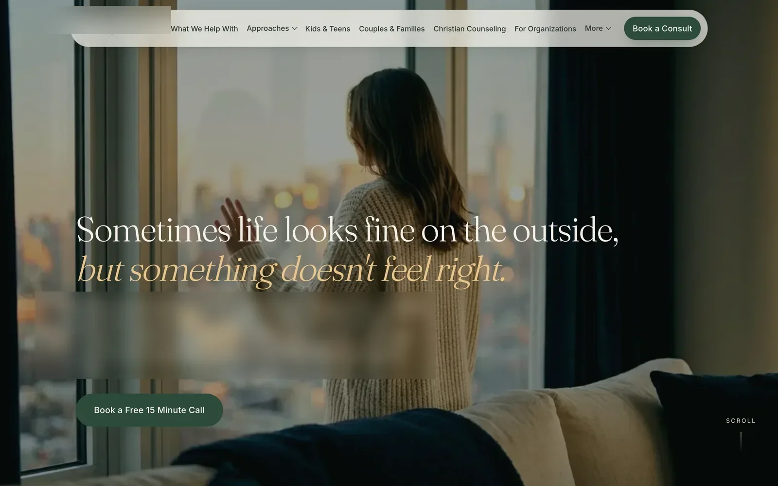

Real captureWebsite · Booking · Quiz
01
The problem
Someone looking for a therapist may be tired, unsure and reading on a phone. The practice needed a site that felt calm, answered the money question up front, and made one next step obvious: a free 15-minute call. Every page had to support that one step without feeling pushy or busy.
People rarely book with the first site they open. They compare a few, and they close the ones that feel cold, pushy or vague about cost. When that happens, the practice never finds out.
The practice is private pay, so price is part of the very first decision. Hiding it behind a phone call adds one more hard step for someone who already finds it hard to reach out.
The site also had a lot to carry: several kinds of therapy, several kinds of clients, sessions online across Texas and in person in Houston. All of it had to fit without the home page turning into a wall of links.
02
What we built
We built a full practice website around one action: book a free 15-minute call. It has a calm home page, a page for each service and approach, fees on the home page with a full fees page behind them, a short burnout quiz, and the notices the practice publishes, all designed for phones first.
- A home page that opens on a slow, scroll-driven scene and one button: book a free 15-minute call.
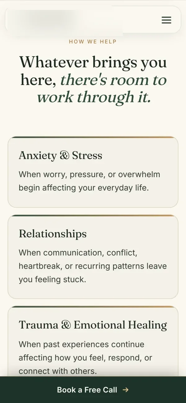
- A booking button in the top bar on every page, and a Book a Free Call bar pinned to the bottom of the phone screen.
- Service pages for individual therapy, couples and families, kids and teens, Christian counseling, and organizations.
- A page for each approach the practice uses, plus a How We Work page that explains how the approach gets chosen together.
- A fees section on the home page, and a full fees page with session rates, insurance and superbills, payment and the cancellation policy.
- A Good Faith Estimate page and the Texas consumer notice, linked from the fees section and the footer.
- A free burnout quiz: 10 statements, about 2 minutes, results by email.
- A short FAQ for the questions people ask before a first call, like insurance, online sessions and how often you meet.
- A crisis line note in the footer of every page.
- Search basics: a clear title and description on each page, and the practice's address, hours and service area marked up so Google can read them.
03The screens
The site on desktop and phone
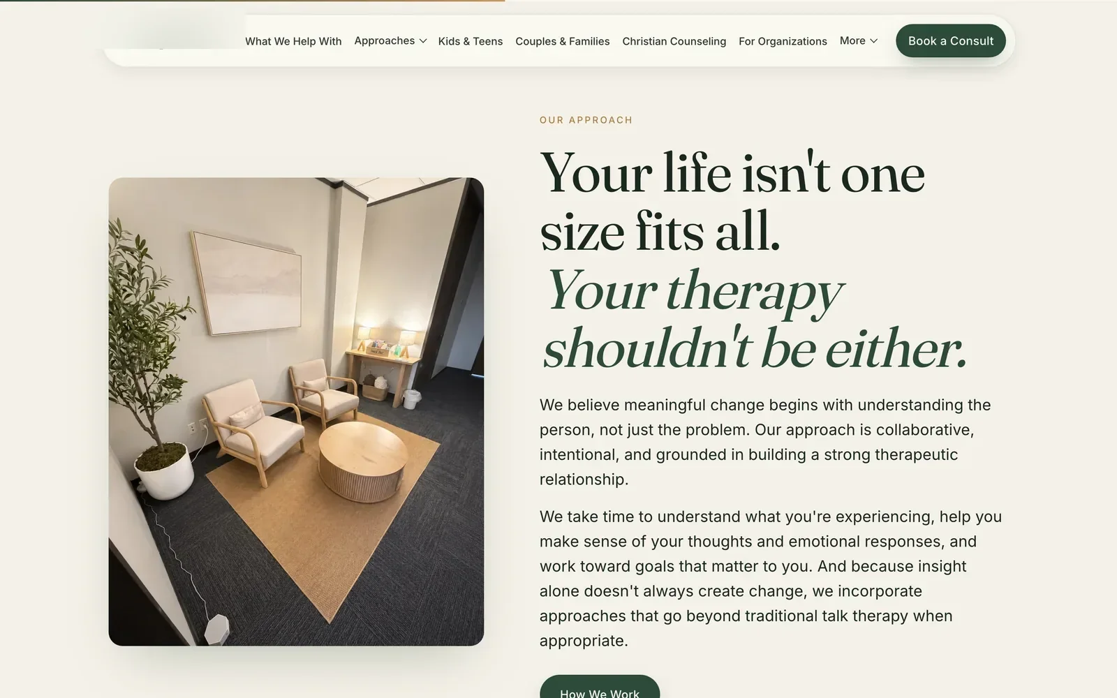
These are real captures of the live site, taken in October 2026 on a desktop screen and a phone. They show the approach section next to a photo of the counseling room, the fees section with three session cards, and how the service cards and fees stack on a phone with the booking bar pinned below.


04
Price and booking, answered up front
Every booking button on the site leads to the same short request form for a free 15-minute call, in the practice's client portal. The fees sit on the home page in plain type, with a full fees page behind them. Nobody has to call or email just to find out what a session costs.
The button shows up wherever a reader is ready to act: in the top bar on desktop, in the first screen under the headline, at the end of the page, and in the bar pinned to the bottom of the phone screen. Each one opens the same form, so nobody wonders whether two buttons do different things.
The phone number and email sit at the end of the page as tap-to-call and tap-to-email links, for people who would rather talk to a person first.
The fees section shows three cards, one per session type. Each card shows the price, the session length and who it is for. A line under the cards says the practice is private pay and that paperwork for out-of-network reimbursement may be available, with links to the full fees page and the Good Faith Estimate.
The full fees page goes further. It shows what weekly sessions add up to over six months and over a year, how insurance and superbills work, the questions to ask your insurer, when payment is due, and the cancellation policy. Nothing on it needs a phone call to decode.
05
Calm design that stays light
The design is quiet on purpose: warm cream backgrounds, deep green type, one serif for headings and one clean sans for reading, real photos of the counseling room, and slow, soft motion. Under that calm surface, the opening scene, the photos and the fonts are all set up to load quickly on a phone.
The opening scene is a run of still frames drawn as you scroll, not a video the phone has to seek through. The first frame is fetched before anything else, the rest fill in a few at a time so scrolling works right away, and phones get their own set of frames, framed for a tall screen.
Photos further down the page load only as the reader gets close to them. The fonts connect early and show text right away instead of leaving a blank space while they arrive.
Motion stays gentle. Sections fade up as they come into view and scrolling is smoothed. Anyone whose phone asks for less motion gets a still page, with the scroll scene and the animations turned off.
The words are short and set in large type with plenty of room around them. The "You might be here because" list is written the way people talk about their own week, so a visitor can recognize themselves before reading a word about methods.
06
A burnout quiz for people not ready to call
Not everyone is ready to book a call. The site offers a free burnout quiz instead: 10 short statements, four answer choices each, about 2 minutes. It looks at energy, emotional capacity, purpose and the body, sends the results by email, and says plainly that it is a reflection tool, not a diagnosis.
The home page introduces the quiz in its own section, and it sits in the main menu, so it is easy to find from any page.
The quiz has a page of its own. The bar pinned to the bottom of the phone screen steps aside there, so nothing sits on top of the questions.
At the end, the person can leave a first name, which is optional, and an email for the results. A checkbox lets them ask for a free 15-minute consult invite in the same step, so the quiz can lead to a conversation without a hard sell.
The disclaimer is on the quiz page itself, not buried in a policy: the quiz is for education and self-reflection and does not give a diagnosis. On a topic like this, that line matters more than any design choice.
07
What it does for the owner
The site answers what a new client wants to know before the first call: what it costs, whether insurance helps, online or in person, how often you meet. That leaves the free 15-minute call for what matters, finding out if it is a good fit. We are not showing numbers for it.
It gives the practice one link to hand to anyone who asks, and every page on it leads to the same next step.
It gives people who are not ready yet a softer first step in the quiz, with a simple way to ask for a call when they are.
We do not show inquiry counts or booking numbers for this site. Inquiries to a therapy practice are private, and we would rather show the work than a number we cannot share in full.
08
What a person still decides
The site makes the first step easy. It makes none of the decisions that belong to the practice. The therapist decides who is a good fit on the free call and what care looks like. The practice sets its fees and policies. The site gives no advice, and it points anyone in crisis to the 988 line.
- Who is a good fit. That gets decided on the free call, between two people.
- What care looks like. The service and approach pages describe the options. Choosing one is a conversation with the therapist.
- Fees and policies. The practice sets them. The site only makes them easy to read.
- Quiz results. They are a starting point for reflection. The page says so, and the next step it offers is a conversation.
- Anything urgent. The site does not try to help in a crisis. The footer points to the 988 line, which anyone can call or text at any hour.
09
What we would do differently
Three things, all small and all fixable. We would export sharper opening frames for phones, check every fee card at every screen width before launch, and save a speed score on launch day. None of them stop the site from working, and each one is a quick check we would add before the next launch.
- Sharper opening frames on phones. In our own phone capture, the opening photo looks softer than it does on desktop. Next time we export the phone frames sharper and check them on a real phone before launch.
- Check every card at every width. One fee card loaded with a small line out of place in our capture. It is minor, but the fees are where a careful reader decides whether to trust the page, so next time they get a visual check at every screen size.
- Save a speed score at launch. This page describes what keeps the site light but shows no score, because we only publish numbers we measured and kept. Next time we save the score on launch day and show it here.
Related
The services behind it
Free 30-minute call
Want a site that makes the first call easy?
Book a free 30-minute call. We will look at your current site with you and tell you what we would change first.
Flat price in writing · You own what we build · Houston and about 50 minutes around